JOURNAL ENTRY #1
Initial Project Pitch.
Starting this project proved to be much tougher than I thought it would be... I, for some unexplainable reason had this expectation that an idea would just suddenly pop into my head. Unsurprisingly, the summer went on and nothing...
At this point, all I knew was that I enjoyed photography and graphic design (for after all, they are my two concentrations within my majors) - so I began brainstorming with those two media in mind.
Photography has always been something I have enjoyed since I was a child. I would sneakily borrow my parent's cameras and take photos of EVERYTHING and EVERYONE. This included - and most certainly was not limited to - photos of textures such as popcorn, flowers, and pillows, as well as close ups of some very unamused people whom I decided had no choice other than to be my "muses" or "subjects."
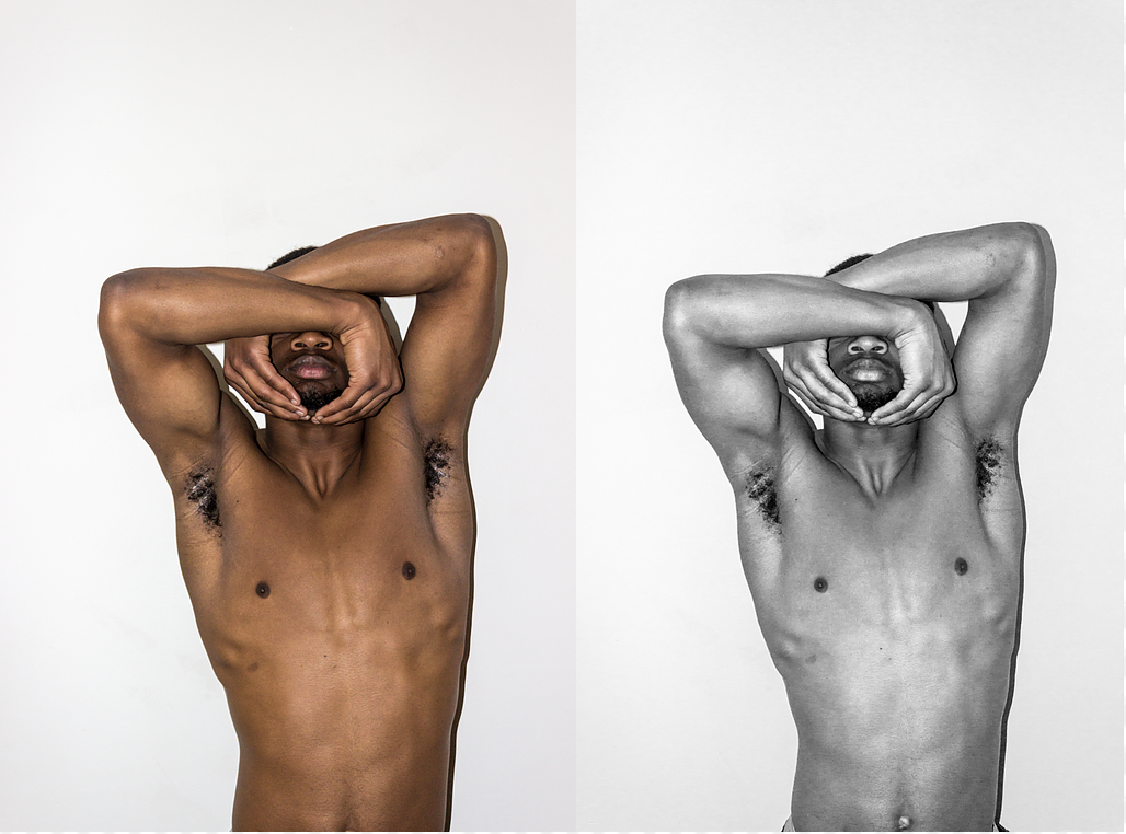
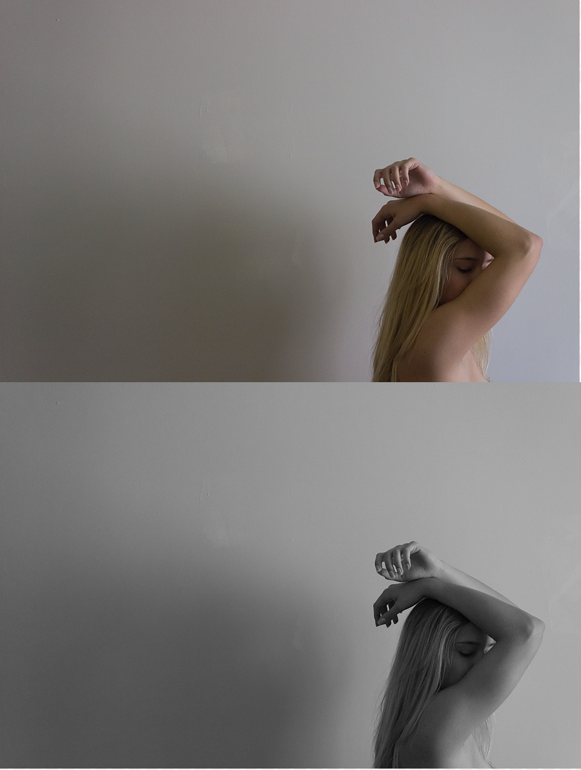
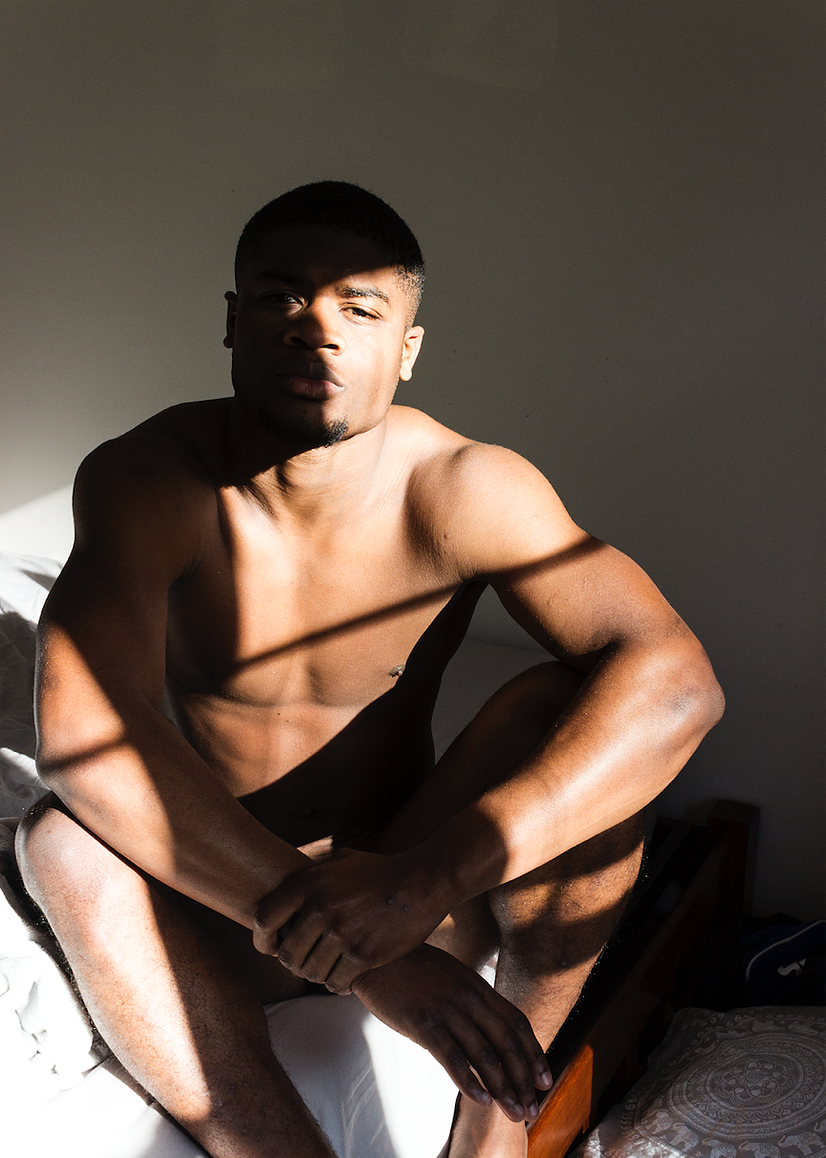
It seemed natural to continue my passion. My initial project pitch entailed exploratory portraits of the human body forms using complex body compositions and experimental uses of light. I decided that I wanted to work in black and white because I have always felt that it added a certain type and amount of depth to the photo, while leaving ti up to the viewer to attribute "colors" that they see within the photograph - making it a more interactive and intimate experience.
During my Photographic Essay course with Professor Terri Bright at Furman University, I was able to explore the bare human form during my Spring Semester of Junior Year. I developed photos digitally that were both in color and in black and white.
By photographing and exploring the human body form, I hope that the project will unfold itself and reveal an underlying theme or purpose, since I have not found a strong calling towards any cultural or historical references or purposes.
Below, I have featured a few of my original pieces from that course that have inspired this.
JOURNAL ENTRY #2
An Idea Develops.
After the first week of presenting and discussing project pitches, I felt a bit discouraged about my senior project. I had lost any sense of direction and hope that this project would become anything.
I spoke with family, friends, and a few of my professors to gauge some sort of idea or perhaps motivation to keep searching. At this point, I was struggling - which I might admit I have been for a while - to figure out what it is about which I am truly passionate.
I kept thinking and thinking... attempted to dig deeper and deeper... to find that passion. Then it hit me!
POETRY.
Poetry has proved to be a meaningful outlet for me through rough times and even times that I just wanted to explore the inner depths of my mind in which I have found hard to navigate. Writing - words in particular - have always been a gateway for me to express myself. I often get trapped in my own mind and am unable to organize and comprehend what it is exactly that I am trying to grasp. Writing has enabled me to find a voice.
*if you would like to read some of my poetry, check out my POETRY page under WORK*
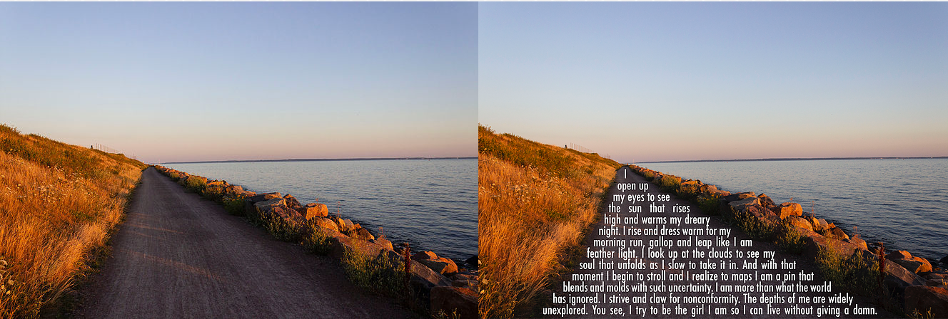
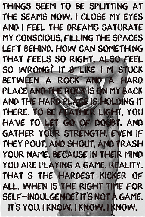
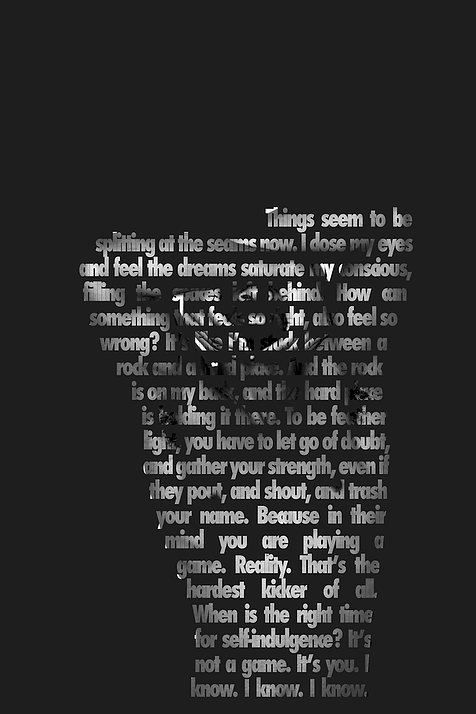
I began exploring the visuals of my poetry through my photography - in attempts to produce a perfect marriage of my two passions - while combing the two elements through my graphic design skills. Ultimately, I began using the text as shapes and then superimposed the image within the text to create an illusion of a complete photograph from a distance, however, as you approach it, the text reveals itself and becomes more apparent and legible. This allows the viewer to pause and take a moment to look closer and experience that intimacy with my work for which I strive.
I could feel the wheels turning in my head and the excitement began to build up. However, I did become a bit concerned that perhaps the text would take away from the photography, and vice versa. You could saw being faced with obstacles and being forced to come up with solutions is all part of the beautiful thing called the artistic process.
JOURNAL ENTRY #3
Talks and Art Shows.
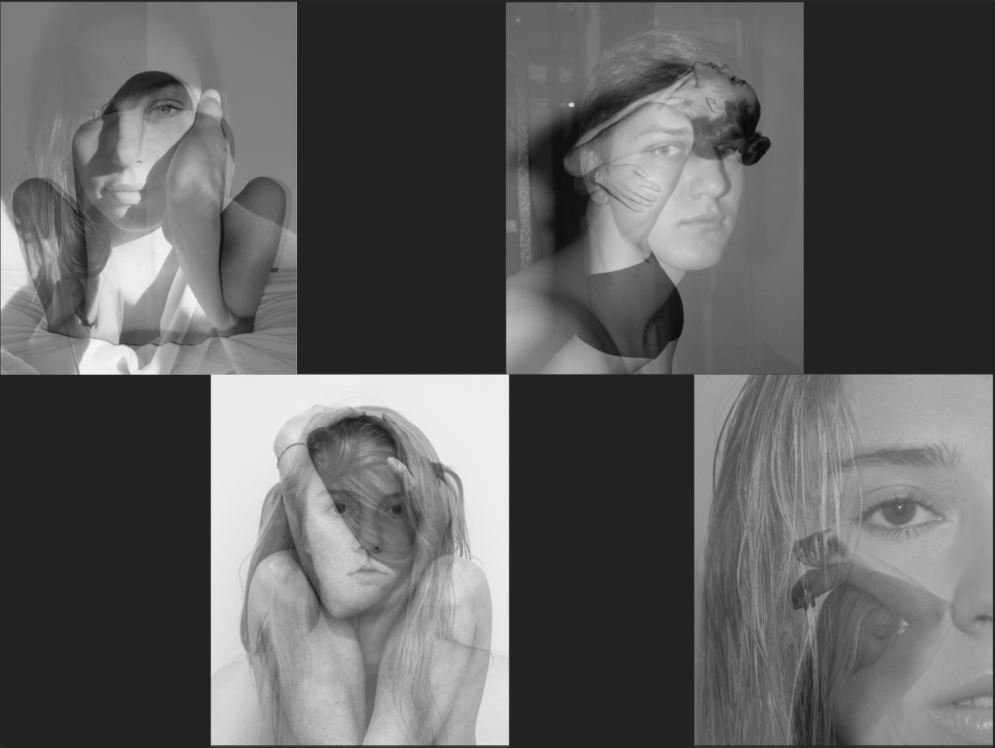
Once again, I had hit a wall. How do I combine my poetry with my photography without one component taking over? I created "mood boards" to pull in images that I felt had the potential of capturing the emotions and compositions that I was looking for to couple with my poems. I battled with the decision regarding how many images I should pair with each poem since my poems varied quite a bit in length.
Each poem is suggestive of one another in terms of tone and voice. This aided me during my photoshoots.
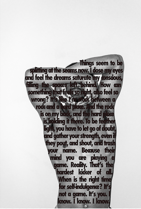
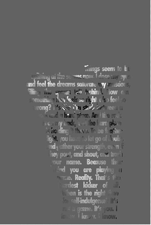
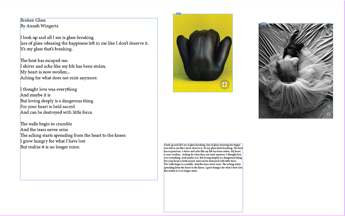
Unfortunately, I ended up with only one image that I felt deemed usable for the project in encapsulating the intended visual of my poetry. The image I have featured below is of a bare-back that I paired with my poem "Broken Glass."
Throughout the semester, I ended several Art Show receptions that were put on my the Furman University Art Department . One show, in particular, that stood out to me was "Simple Machines" by Matthew Wilt. I really enjoyed his artist talk about how he interrelated the human with the man-made. In a way, I was doing the same sort of thing with my poetry and the visuals of photography - experimenting with how the two could interplay with one another.
Then it hit me.
I looked back to Middle School when I had this little bookmark that I had purchased from the school book fair. This particular bookmark was special. It had an open field with several horses on it. The fascinating this was that when you moved the bookmark from side to the side, the horses appeared to be running!
I delved into some research on how this process works and it is called Lenticular Flip Imagery. The process would entail interlacing two photographs and applying a lenticular lens sheet to that interlaced imaged to make the illusion come to life.
Mood Board 1
Mood Board 2
Mood Board 3
Bare Back Photograph
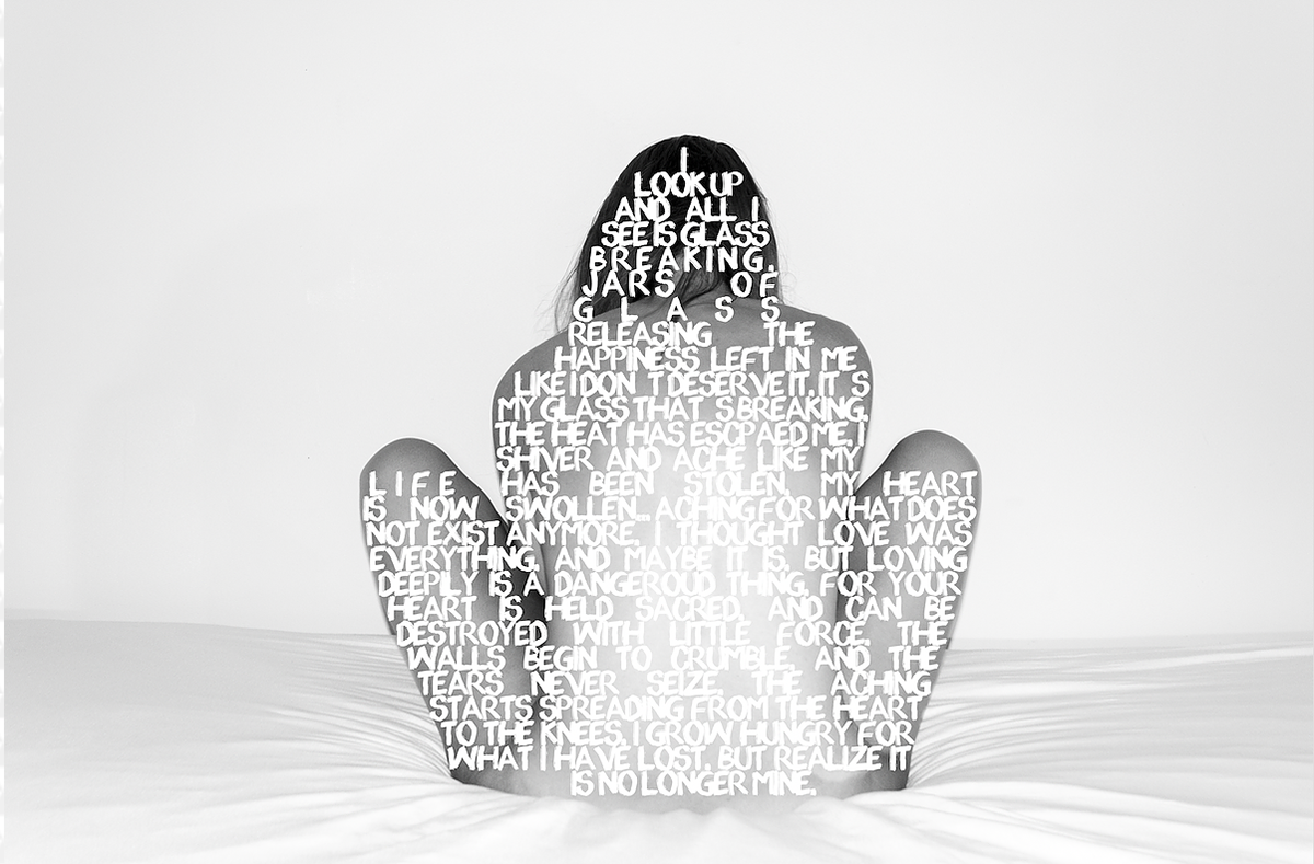
Bare Back Poem + Photograph 1
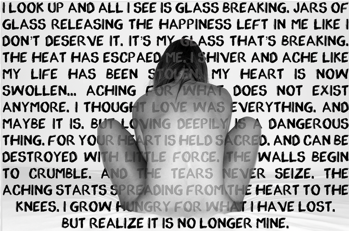
Bare bAck Poem + Photograph 2
Matthew Wilt "Simple Machines"
JOURNAL ENTRY #4
An Idea Comes to Life.
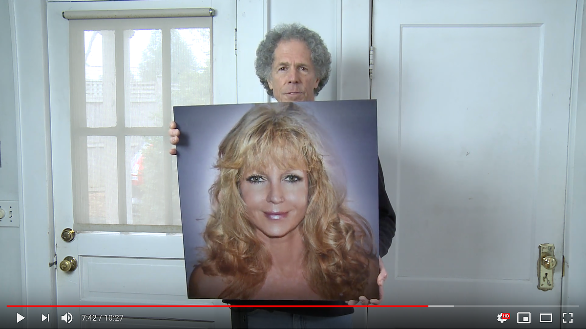
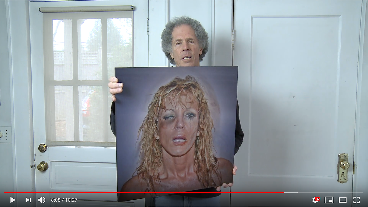
I had finally found my direction! I dug deeper into my research and found Dan Vojtěch from the Czech Republic who is Red Bull's official photographer. I watched one of his projects where he created a Lenticular 3D Photograph for a campaign on YouTube, which I have included below.
The next artist I looked into was Miggs Burroughs, who is a graphic designer (and photographer) who has mastered the lenticular process in his work. He has detailed video on YouTube showcasing his process, which I found fascinating. He often used two photos to juxtapose each other to create a powerful illusion that confronts you and makes you think.
After learning about the process, it was time to figure out where I could attain the resources to achieve this as well. I found VueThru.com, which proved to be the best and most reliable source for purchasing these lenticular lens sheets. You can purchase these sheets that already have the adhesive on them.
I decided to purchase a pack of 25 lens sheets measured at 8x10 inches as the testers/prototypes for the project since the lens sheets are not cheap. I wanted to also familiarize myself with the process before I attempted it at the much larger scale. At this point, my aim was for the final size to be either 16x20 or 20x28 inches.
I have found a project that I am really passionate about and I cannot wait to see how it all turns out!
In addition to the videos, I have included my first lenticular flip prototype below.
JOURNAL ENTRY #5
An Idea Transforms.
As I experimented with super imposing my text within my images and applying the lenticular flip lens sheets, I came to realize that the text simply will not be legible enough to use within the lenticular image.
So how was I supposed to make a lenticular image interesting enough, while also providing a sort of "narrative" to accompany or complement the poetry?
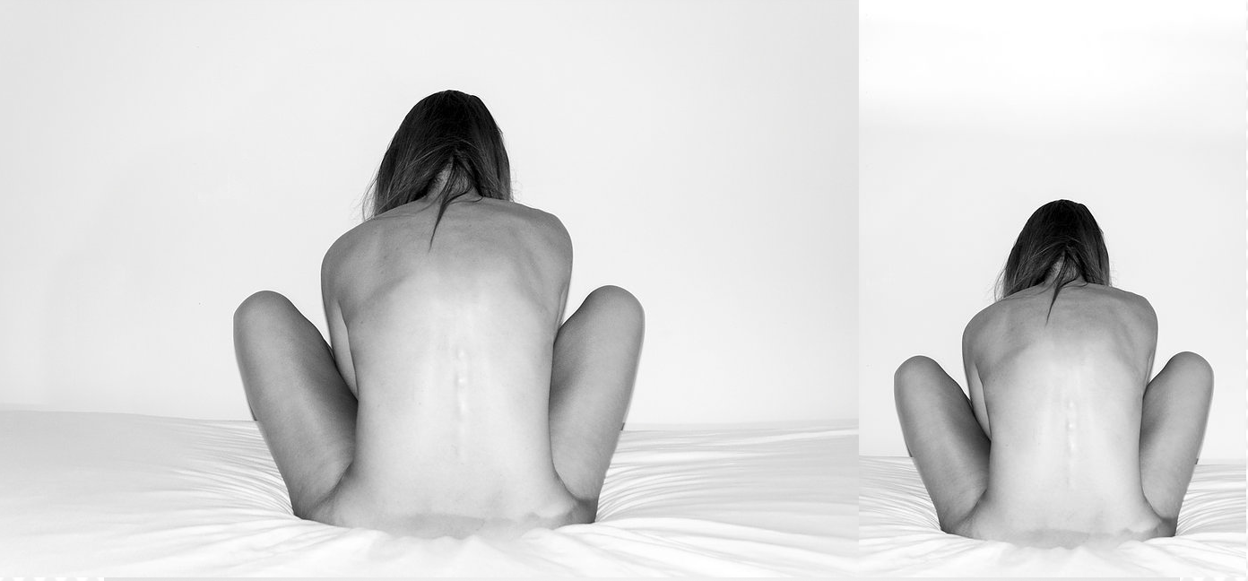
I referred back to my guy Miggs Burroughs who had complete a dichotomy between to images to tell a story, highlighting a woman who underwent sexual assault (shown below).
So I decided to give it a try myself by using a dichotomy of two images interlaced to facilitating the narrative of my poetry. The results were better than I could have imaged.
As I was familiarizing myself with the process, it became evident that I had not attached the lenticular flip lens precisely because the "flip" effect was neither seamless nor vertical. You could still see both of the images at the same time - which is alright to a certain extent - however there should be a point where you can see only one or the other, which this one in fact did not.
These are the little things that I will be working out and finessing throughout the process of this project.
JOURNAL ENTRY #6
A Narrative Develops.
Everything in life has a narrative, whether it's an obvious, in-your-face narrative or a subtle one that takes intuition and creative understanding.
At this point, the narrative in my project may seem a bit "obvious" - the visuals of my poetry. But actually, there is much more to it. There is a dichotomy of images at place that adds to that narrative.
Not only have a drawn inspiration from my poetry, as well as inspiration from photoshoots and models, I have played around with the narratives of the composition of my narratives and how the two images exist together and separately. I love the energy and raw potential of the photographs that I have shot thus far.
JOURNAL ENTRY #7
The Logistics.
As aforementioned, I purchased a pack of 25 lenticular flip lenses that were the size 8x10 inches so that I could familiarize myself with the material and test out the dichotomies that I produced. I had envisioned that the final product would be much larger - the size 20x28 inches. Of course, (naturally) this was a bit ambitious.
In critique, professors and my fellow classmates had expressed concerns about the large size taking away from the intimate experience of the artwork. I somewhat disagreed. I felt that larger size would help not only draw in attention but also make the special effects of the lenses come even more to life!
So, after speaking with Professor Chance and explaining my concerns, we came up with a compromise - 16x20 inches. Large enough to satisfy my vision yet small enough to not overwhelm and maintain its intimacy component.
The next issue would the paper size to go with the new size of the lenticular flip lens sheets. The regular printer does not print larger than 11x17 inches, which meant I would need to print from the epson, inkjet printer.
I ordered a roll of paper that would fit in the printer and could print off the larger images.
JOURNAL ENTRY #8
The Daguerreotype.
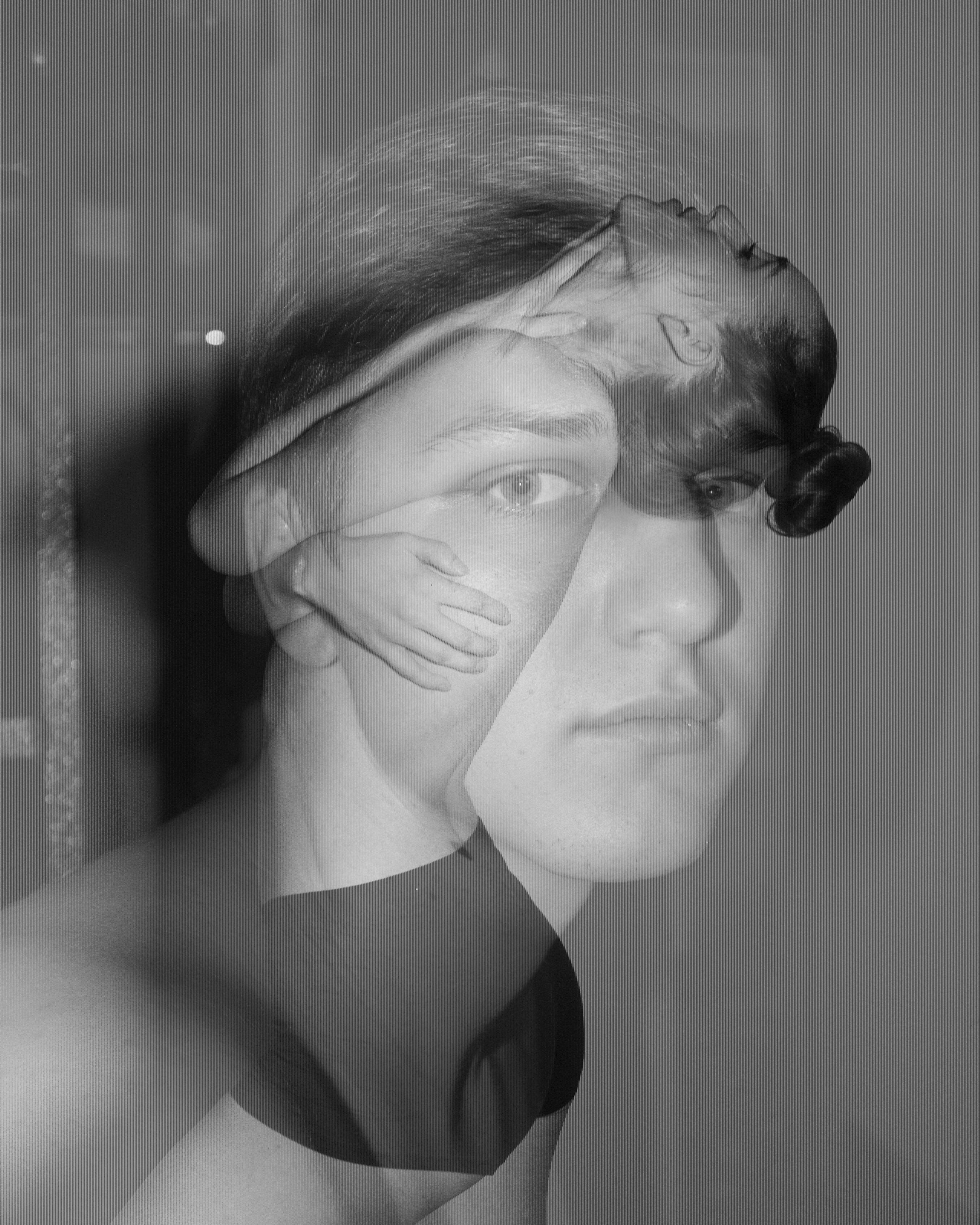
During one of my critiques, Professor Bright mentioned an observation she had made - my work was highly suggestive of that of an early daguerreotype. According to Daguerreobase, "the daguerreotype was the first commercially successful photographic process (1839-1860) in the history of photography" and was named after the inventor, Louis Mandé Daguerre.
My images produce a "silvering effect," similar to that produced by the magnesium and silver materials used in producing a daguerreotype. Although the processes are quite different in that the daguerreotypes use magnesium and silver coupled with light exposure to produce an image, while my project entails digital photography combined with lenticular lens sheets adhered to those digitally interlaced images, their results are quite suggestive. Each appears to either "flip" from a negative to a positive image or "flip" from one experience to another within the dichotomy interplay.
At this point, it was time for me to put all of my ideas and connections into word through an original artistic statement.
JOURNAL ENTRY #9
Original Artistic Summary.
“The Silver Lining of Being Human” has allowed me to delve into my passions for poetry and photography. Throughout my life, poetry has allowed me to visualize my experiences in which I so often get lost. I get overwhelmed and unable to make sense of what is going on, not just around me, but within me. Like poetry, photography allows me to access a different perspective and view life from the “outside” in a sense. Since I am an avid writer and photographer, I thought it fitting to capstone my Communication Studies and Studio Art degrees with concentrations in Graphic Design and Photography with a combination of my experience in both directions, highlighting my passions for the visual representations of human being.
Initially, I experimented using my text as the shape of the image by super-imposing the image itself within the text, creating the illusion of a photograph from a distance; however, as you get closer to it, the poem reveals itself. I could feel the wheels turning in my head and the excitement building up; however, although the idea was great, and the results proved potential, it seemed that perhaps the text would take away too much from my photographs.
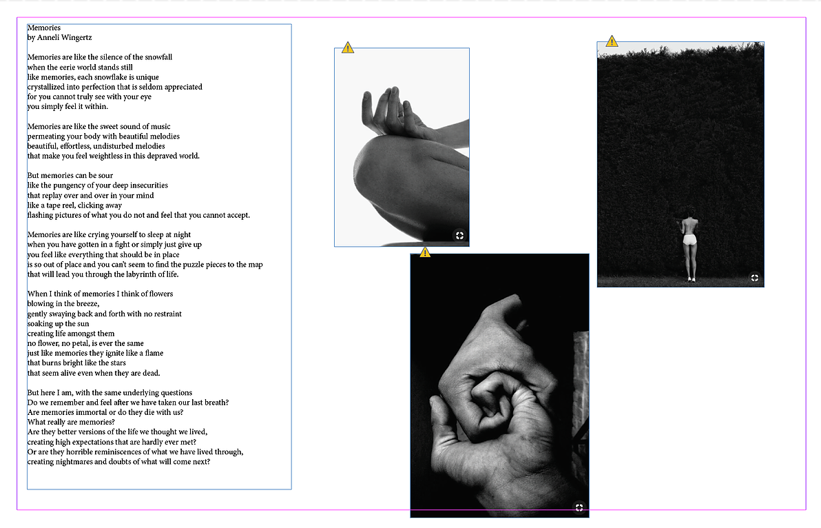
I took a step back andcreated "mood boards" to figure out what kind of photos I would like to capture to couple with my poems. I battled with deciding how many photos I would pair with each poem for the poem lengths varied quite a bit. Each poem has similarities in tone and aesthetic, which allows for a cohesiveness to the exhibition. Additionally, working in black and white because it adds a certain raw and thought-provoking depth to the photograph, leaving it up to the viewer to attribute the "colors" that they see within the photograph. I completed a photographic essay during the spring semester of my junior year, called “Only Human,” that explored the human body’s naked form, which has proved helpful in the development of this project.
I attended “Simple Machines” with Matthew Wilt, and I really enjoyed his talk about interrelating the human with the man-made. In a way, I was doing the same sort of thing with my poetry and visuals through photography – playing around with how the two could interplay with one another, interrelating the human experience with visual narratives. Then it hit me – lenticular flip imagery! The first time I held one was in 3rdgrade at my elementary school’s book fair. I purchased a bookmark with horses on it and was amazed that when I tilted the bookmark from side to side, the horses appeared to be running!
I began researching immediately. The process of creating a lenticular flip photograph would entail interlacing two photographs and applying a lenticular lens sheet to make the illusion come to life. Once I finally found my direction, I began to dig deeper. One of the first artists I looked into was Dan Vetch. He worked with Red Bull to create a lenticular flip photograph, which I was able to witness on YouTube. In my research,I also ran into Miggs Burroughs, who is a graphic designer (and photographer) who had jumped into using the lenticular process in his work. I also watched an extensive video on his process on YouTube. He often used two juxtaposed photographs to create a powerful illusion that confronts the viewer immediately.
I found a company that was credited to be the best and most reliable source for purchasing lenticular lens sheets. I decided to purchase a pack of 25 lens sheets with adhesive, measured at 8x10 inches to use as my prototypes. These lenticular lens sheets are not cheap, and I decided it be beneficial and smart for me to master the process before attempting it at a much larger scale. My final pieces will be measured at 16x20 inches. Each size has a specific mathematical formula for pixel count and size to ensure seamless “flipping.”
As I experimented with super-imposing my text within my images and applying the lenticular flip lens sheets, I came to the conclusion that the text simply will not be legible enough to use within the lenticular image. So how could I make a lenticular image interesting enough, while also providing a sort of "narrative" to accompany or complement the poetry? I referred back to my guy, Miggs Burroughs, who had utilized a dichotomy between to images to tell a story, highlighting a woman who underwent sexual assault, showing her appearance before and after the incident. I decided to give it a try myself by using a dichotomy of two images interlaced to facilitate the narrative of my poetry. The results were better than I could have imaged; however, it became evident that I had not attached the lenticular flip lens precisely because you could still see both of the images at the same time. I do not actually mind it so much that you can see both at once for it adds another sort of dimension to it.
“The Silver Lining of Being Human” explores the visuals of my poetry through lenticular flip imagery. We are only human, and there are more than two sides to our stories. We are made up of lots of different dichotomies. What is told is different than what is seen. What is revealed is often not as it seems. The use of black and white allows the viewer to add their own “color” or story to each lenticular image, hopefully making connections to the poetry coupled with it. The experience of viewing my lenticular flip images is like that of a daguerreotype in that unlike viewing any other photograph, the image does not appear to sit on the surface of the material used. Like the daguerreotype appears to “flip” from positive to negative as the viewing angle of the image is adjusted, my images “flip” from one experience or image to another as the angle of view is adjusted—thus the viewer will experience an apparition in space—a sort of illusion that arises when the eyes are properly focused. The “silvering effect” of early daguerreotypes parallels, or rather acts as a double entendre for, the silver lining revealed in my project.
JOURNAL ENTRY #10
"How Easily We Scar"
Obviously a lot has changed since the beginning of this project. First of all, the I have renamed the series "How Easily We Scar." Originally, I had wanted to have six pieces coupled with six poems (one poem per lenticular image). However, as I worked through my project, I realized that the poem I felt a connection to the most needed more than just one image (especially due to its length).
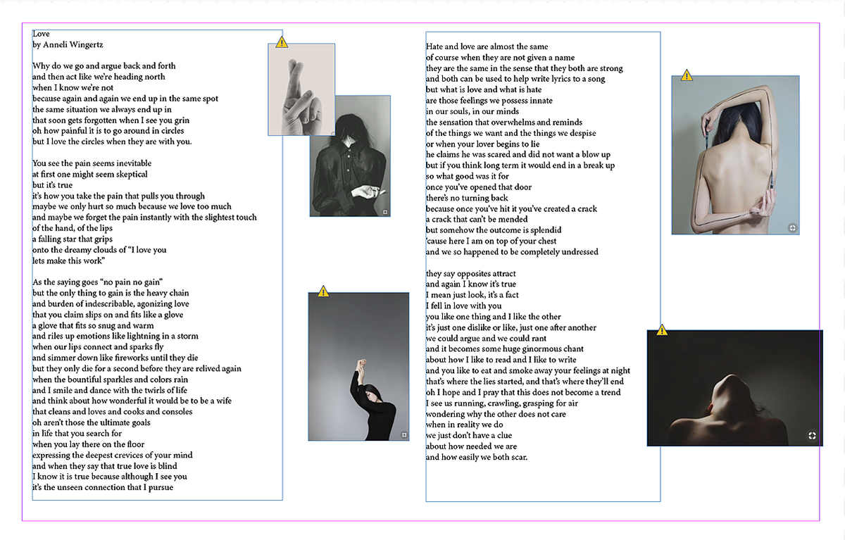
I chose my original poem "Love." With it, I had created about 20 compositions/combination of images from which I was to narrow down. Finally I chose for pieces that I felt encapsulated the raw emotion that I was trying to convey.
I chose to separate the images from the poem in my installation because I wanted the viewer to people to add their own colors and experiences to the images they see. I want it to be more than just a means of me expressing myself and my experiences, but also an immersive process that enables the viewers to make it their own as well.
Artist Statement
"How Easily We Scar" explores the visual dichotomy of emotions that we feel in relationship with people in our lives. We are human and there is always more than one side to story. We are made up of all sorts of dichotomies. The use of black and white allows the viewer to add their own "color" or story to each lenticular image. Lenticular FLIP imagery uses two images interlaced and attached to a lens sheet, producing that three-dimensional quality seen within these images.
My work resembles a lot of that similar to daguerreotype photography. Although the processes are quite different in that daguerreotypes use magnesium and silver, their products are quite suggestive. The experience of viewing my lenticular FLIP images is similar in that unlike viewing any other photograph, the image does not appear to sit on the surface of the material used. As the daguerreotype appears to "flip" from positive to negative as the viewing angle is adjusted, my images also "flip" from one experience or image to another - thus the viewer will experience an apparition in space - a sort of illusion that arises hen the eyes are properly focused. the "silvering effect" of the daguerreotype and lenticular images parallels the silver lining revealed in my project. We humans are fragile and easily scar, and it is up to us to find the silver lining in our experiences.